My Landscape Photo Editing Workflow: From RAW to Finished Image

Editing has a bad reputation among photographers who'd rather be outside. A lot of people treat it as the tax you pay after the fun part, a technical chore to get the file ready for print and web.
I see it the other way around. Editing is where you can relive the moments you had outside, polishing what you captured into the ultimate memory. A piece of art, a print or an image for the internet. It's the step where you take a technically correct file and make it coherent, where you emphasize the parts of the image that carry the story and quiet the parts that don't, where you guide the viewer's eye through the frame instead of leaving it to wander. Without that step, most images are a little bland, or they all look the same. With it, paired with a mind that has something to say, photography becomes an art form worth practicing.
So this is my full editing workflow, the real order I work in, from choosing a file to the finished image. I want to be clear about one thing up front: this is one way to do it, not the way. There are many valid approaches, and none of them is more correct than another. But this is the process behind the images I've been posting for the last couple of years, so if you like how those look, this is how they're made. These days it happens almost entirely in Lightroom. I'll tell you what I do at each step and, more importantly, why, because the why is the part you can actually learn from. I won't hand you every last technique here, some of that lives in my course and my workshops, but you'll see the whole shape of how I work, and it's enough to change how your own images turn out.
A note before we start: everything below can be done in Lightroom, start to finish. The same applies to Adobe Camera Raw and Bridge, the buttons look different but it's the same underlying engine. I still open Photoshop for heavier retouching, removing distractions, warping, complex cleanup, but I reach for it less every year, because Lightroom's tools now handle most of what I used to need it for. For this workflow, you can stay in one program.
Step 1: Choose the right file
The edit can't add what the capture didn't get. So it starts with picking the right frame from the folder, the one where the technical elements you care about are already there. If you want a razor-sharp image, start from a sharp file. If you want a soft, out-of-focus background, start from the file that actually has that bokeh. No amount of editing invents those things convincingly. Choose the frame that already holds what you're after, then make it sing.
Step 2: Clear the technical imperfections first
Before I make a single creative decision, I run the file through DxO PureRAW. It handles noise, detail and sharpening at the RAW level, cleanly, so that everything I do afterward is built on a technically solid file. I wrote a full review of DxO PureRAW 6 if you want the detail on what it does and why it goes first, but for the workflow, this is the foundation step. Get the technical noise out of the way before you start shaping the image.
Step 3: Set the canvas with a color profile
Back in Lightroom, I start by applying a color profile, either an Adobe one or a custom one. It doesn't much matter which. This just sets the canvas, the baseline the rest of the edit is built on. Pick one you like the starting point of and move on. This isn't where the work happens.
One thing that's already handled by this point, so you don't have to think about it: on import, I have lens corrections applied automatically, chromatic aberration, distortion and vignetting for the lens on file. That means the technical lens cleanup is done before I even start editing, and it's off my mind for the rest of the process. If you're not doing this yet, set it once in your import preset and forget it.
As some of you know, I shoot with the Nikon Z8, which yields rather beautiful color out of the box. But there are camera models that deliver RAW files needing more work to get the colors right. If you have one of those, look for custom profiles made for that sensor. If there's demand for it, let me know, and I'll write an article on that soon too.
Step 4: Exposure
Now the real editing begins, and I start with exposure.
I bring the highlights down a touch if they need it, and I very often raise the shadows. Here's why: in the field, I expose to protect the highlights, to keep all the detail in the brightest parts of the scene. That often leaves the file looking a little dark. Some people would call many of my RAWs underexposed. They're not, they're exposed exactly the way I want, because I know I can lift those shadows later without any trouble. So the first move is usually recovering that shadow detail I deliberately protected in camera.
Step 5: Contrast, without the contrast slider
This is one of the most useful things I can teach you, and it's simple.
I rarely use the contrast slider, and when I do, only very lightly. It's a blunt tool, it pushes the whole image at once and tends to overcook everything. Instead, I build contrast with the whites and the blacks: raising the whites, lowering the blacks. That puts the contrast into the right tones, the right ends of the range, instead of globally crushing the image. You get depth and punch without the plasticky, heavy look the contrast slider gives you.
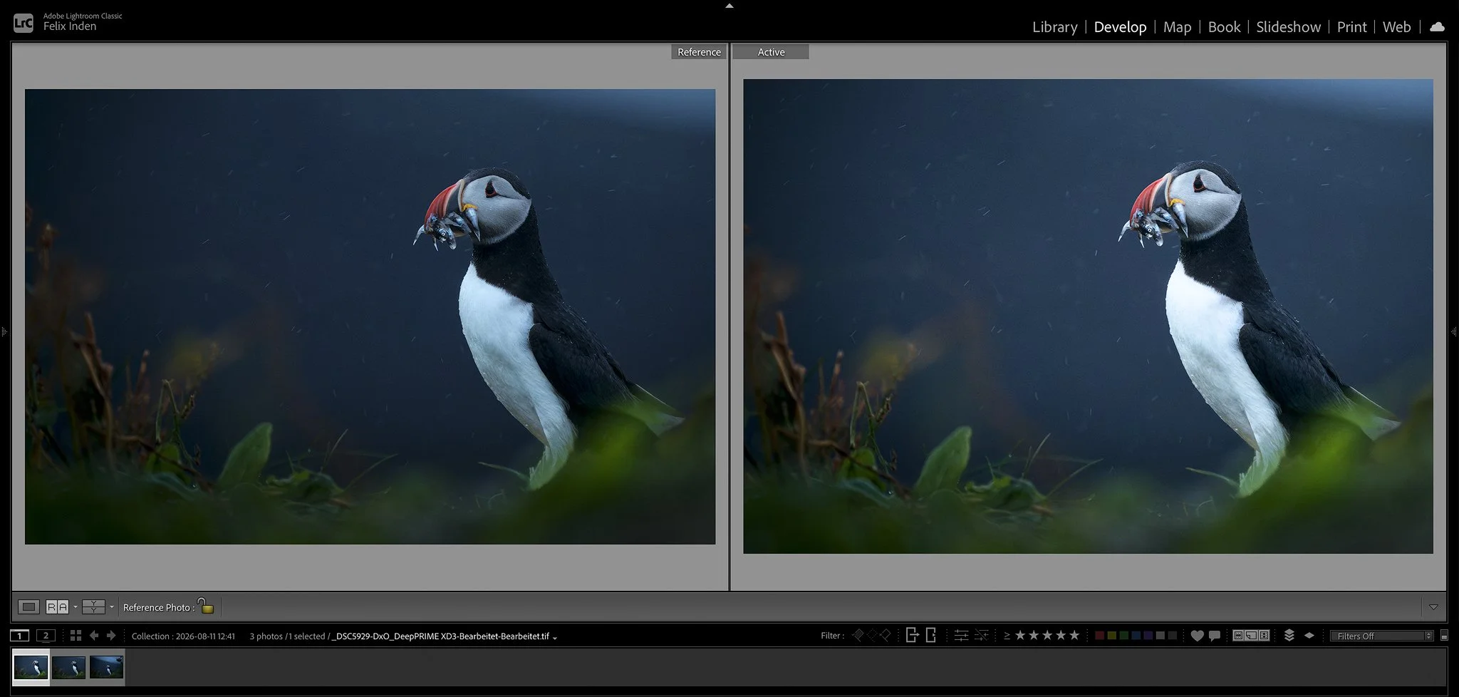
A tip that makes this precise: hold Command (or Alt on Windows) as you drag the whites and blacks sliders, and Lightroom shows you a clipping preview, exactly where the highlights start to blow out and where the shadows start to lose all detail. Push each until just before it clips. That said, I most often don't go as far as you technically can. Watch the clipping preview, it's helpful, but look at the actual image more. The levels that are technically possible are often not the ones that look best.
I use structure and clarity here too, but carefully, never more than about +15 globally. The whites and blacks I use more freely, it depends entirely on the image. Clarity is one of those tools that makes the pixels fall apart if you push it, so I keep a hand on it. The exception is inside a selection, when I've masked water, ice, or a texture I want to blow up visually, I'll sometimes push clarity harder there. Locally, not globally.
Step 6: White balance as a creative tool
Once exposure is set, I go to white balance, and I treat it as a creative decision, not a technical one.
I'm not trying to capture the cleanest, most neutral white. I use white balance to express the mood I want the picture to carry. Usually that's the mood I actually remember, the feeling of that morning, that evening, that night. But sometimes I deviate from reality if a different tone suits the idea better. White balance is how you set the emotional temperature of an image through color, so I use it deliberately, not as a correction.
Step 7: Denoise and sharpening — usually nothing
This step is mostly empty now, and that's the point. Because PureRAW already handled noise and detail at the start, I rarely need to denoise again, and I don't add sharpening here at all, the algorithms did that better than I would. Occasionally an image needs a touch more noise reduction, but most of the time I move straight past this. One step handled early saves a whole stage later.
Step 8: Fine-tune the color
Now I have a technically clean file that looks broadly the way I want. But I still want to refine the color, and this is where an image gets its character.
I work in the calibration tab, the color grading, and the HSL panel, hue, saturation and luminance, adjusting the individual color channels. The goal isn't to make everything vivid. It's to see whether I can emphasize the details that matter by shifting or lifting specific colors, and quiet the ones that distract. This is still a global stage, affecting the whole frame, but it's where the palette of the image really gets decided. When this is done, my global edits are finished.
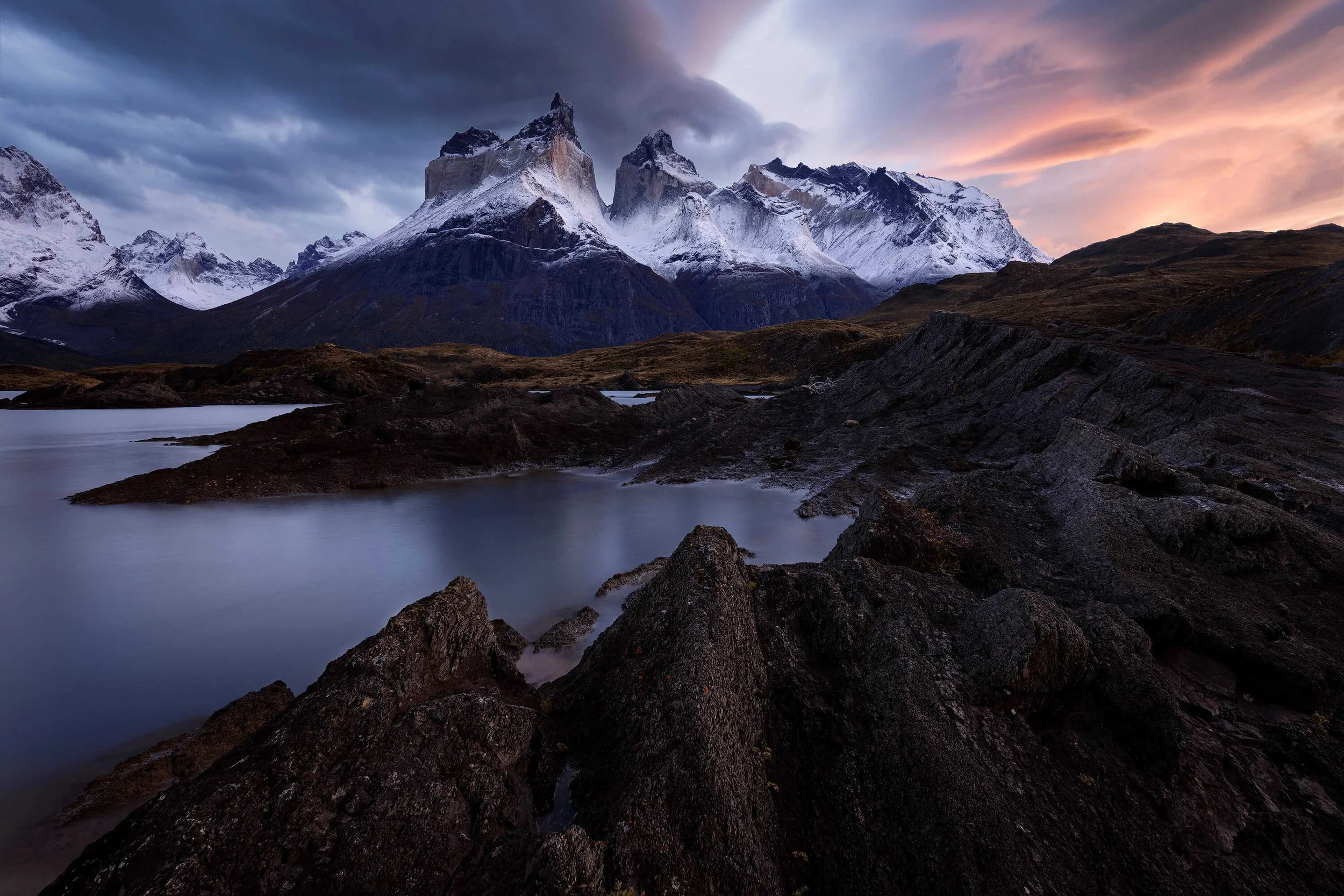
Transitions from warm to cold are very nice to create emotional response in landscape photographs
Step 9: Masking — this is where the eye is guided
Everything so far has been global adjustments, the changes applied to the whole image at once.
Now comes the part that matters most, and the part that separates a well-edited image from a flat one: selective, local adjustments with masking.
Lightroom's masking has become genuinely powerful. Color masks, luminosity masks, object selection, sky and subject detection, use all of it to draw clean selections and work on specific areas. This is where I guide the viewer's eye. I'll darken the areas I want the eye to pass over, and brighten the areas I want it to land on. I almost always add some vignetting to draw the viewer into the frame. I'll lift a foreground with a radial filter, or brighten a specific subject with an object selection.
None of this is decoration. Every mask serves the same goal: make the picture coherent and lead the eye where the story wants it to go. Emphasize what matters. Quiet what doesn't.
Step 10: The finishing pass
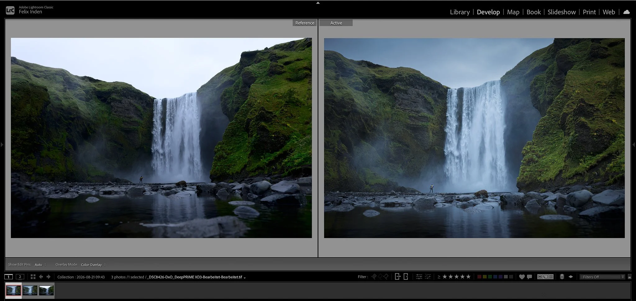
With the file shaped, I finish it with the Nik Collection, run as plugins from inside Lightroom, so there's no need to leave the program. I go into Color Efex for the final color and tone work, the last twenty percent that decides the image, and into Viveza to fine-tune highlights, midtones and shadows. For black-and-white conversions I use Silver Efex. I've written a full review of Nik Color Efex covering exactly which filters I use and how I keep them subtle.
Then it's back into Lightroom for a few final selective masks, darkening a sky a little more, lifting a foreground, one last pass of guiding the eye. Especially when I've re-cropped an image, I go over it again afterward to make sure the vignettes and the effects I used for guiding the eye still work on the new frame. And then the image is done.
The tools I use for this are DxO's, and readers get 15% off the whole range with the code felixinden — the details are in the two reviews linked above.
The thing underneath all of it
If you take one idea from this, let it be this: every step above serves the same purpose. Guide the eye. Emphasize the parts of the image that carry the story, quiet the parts that don't, and keep it tasteful, not oversaturated, not poppy, but coherent, so the viewer looks where you want them to look and feels what you felt. If you prefer it more poppy and saturated, that's great too, and an easy change, just push the same sliders a little further. There's no right or wrong here.
I'll also be honest that this isn't everything I do to an image, there are finer techniques I save for my course and my workshops. But this workflow is the backbone, and I'm confident it will improve your images a lot, especially if you're someone who has never really spent time editing before. Start here, and the difference in your results will be obvious.
That's why editing matters, and why I don't treat it as a chore. In a time when an image can be generated, when you can conjure impossible light and perfect conditions on demand, it's worth being clear about what we're actually doing here. We're not generating anything. We go out and experience the planet, we stand in the real weather and the real light, we capture the memory of something we actually lived, and then we polish it into our own art. The editing is the polishing. The experience is the point.
Free for subscribers
The one-page cheat sheet
My whole workflow condensed to a single page you can print and pin next to your screen — every step in order, plus the rules of thumb I actually follow. Free when you join Postcards from the Wild.
Get the editing cheat sheetKeep exploring — more from Stories from the Wild
DxO PureRAW 6 Review: How It Fits Into a Real Landscape Photography Workflow — the front of this workflow, in depth.
Nik Color Efex Review: The Filter Suite I Finish Every Image With — the finishing step, in depth.
Best Camera Settings for Landscape Photography — getting the frame right in the field, before any editing.